Color is a powerful tool in interior design, capable of influencing mood, perception and behavior. At Design In Vogue, we understand the profound impact of color psychology and use it to create spaces that evoke the desired emotions and responses. This blog explores the principles of color psychology and how it can be applied in interior design to enhance the atmosphere and functionality of a space.
Understanding Color Psychology
Color psychology is the study of how colors affect human emotions and behavior. Different colors can evoke different feelings and reactions, making color selection a critical aspect of interior design. Here's a brief overview of how various colors are perceived:
- Red: Often associated with energy, passion and excitement, red can stimulate the senses and increase appetite. It's a powerful color that can create a sense of urgency or draw attention to specific areas.
- Blue: Blue is known for its calming and soothing effects. It can reduce stress and create a sense of tranquility, making it ideal for bedrooms and bathrooms. Lighter shades of blue are often associated with cleanliness and clarity.
- Green: Green symbolizes nature, growth and harmony. It has a calming effect and can help reduce anxiety. Green is a versatile color that works well in almost any room, promoting balance and relaxation.
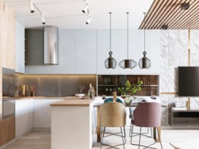
- Yellow: Yellow is a cheerful and uplifting color that can boost mood and energy levels. It's often used in kitchens and dining areas to create a warm and inviting atmosphere. However, excessive use of yellow can be overwhelming.
- Purple: Purple is associated with luxury, creativity and spirituality. It can create a sense of sophistication and mystery. Darker shades are often used in bedrooms and living rooms to add depth and elegance.
- Orange: Orange is a vibrant and energetic color that can stimulate enthusiasm and creativity. It's great for social spaces like living rooms and playrooms. However, it should be used in moderation to avoid overwhelming the senses.
- Neutral Colors: Neutrals like white, gray and beige are versatile and timeless. They provide a clean and sophisticated backdrop that allows other design elements to shine. Neutral colors can create a sense of calm and balance, making them ideal for any room.
Applying Color Psychology in Interior Design
At Design In Vogue, we use color psychology to create spaces that not only look beautiful but also feel right. Here are some ways we apply color psychology in our projects:
- Creating Mood: We use colors to set the mood of a space. For example, cool colors like blue and green are used in bedrooms to create a calming and restful environment, while warm colors like red and orange are used in living rooms to create an inviting and energetic atmosphere.
- Defining Spaces: Colors can be used to define different areas within an open-plan layout. For instance, a distinct color scheme for the dining area can visually separate it from the living area, creating a sense of structure and organization.
- Enhancing Perception of Space: Light colors can make a small room appear larger and more open, while dark colors can create a cozy and intimate atmosphere in larger spaces. We use this principle to enhance the perception of space based on the room's size and purpose.
- Highlighting Features: Bold colors can be used to highlight architectural features, focal points or specific design elements. For example, a brightly colored accent wall can draw attention to a fireplace or a piece of artwork.
- Supporting Functionality: Different colors can enhance the functionality of a space. For instance, a light blue kitchen can create a sense of cleanliness and calm, while a red dining room can stimulate appetite and conversation.
Case Studies and Examples
In a recent residential project, we used a palette of soft blues and greens in the bedroom to create a serene and restful environment. The living room featured warm earth tones with pops of orange to create a welcoming and lively space. Each room was carefully designed with color psychology in mind, resulting in a harmonious and balanced home.
In a corporate project, we used shades of blue and gray in the office spaces to promote focus and productivity. The break areas featured vibrant colors like yellow and green to create an energetic and refreshing environment. This strategic use of color helped enhance the overall functionality and mood of the workspace.
Conclusion
Color psychology is a powerful tool in interior design, capable of transforming the look and feel of a space. At Design In Vogue, we leverage the principles of color psychology to create environments that not only look beautiful but also evoke the desired emotions and responses. By understanding the impact of color, we ensure that each space we design is a perfect blend of aesthetics and functionality, tailored to the unique needs and preferences of our clients.